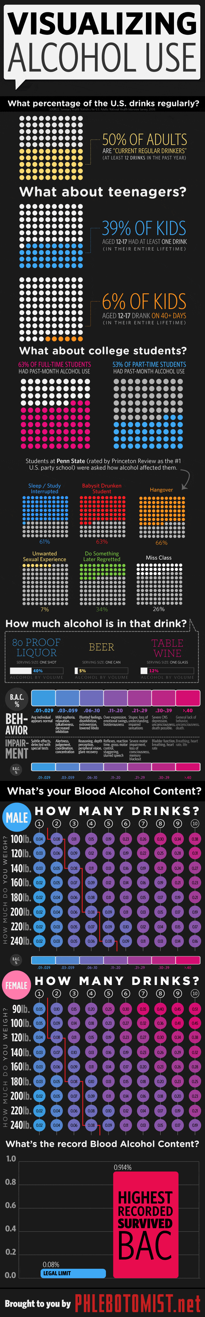
This is a very colorful visualizing alcohol use infographic. We absolutely love the design!
The statistics are presented in a very aesthetically pleasing way which makes the infographic a pleasure to read.
This is a very colorful visualizing alcohol use infographic. We absolutely love the design!
The statistics are presented in a very aesthetically pleasing way which makes the infographic a pleasure to read.